This article is more than 1 year old
Windows 10 Anniversary Update: This design needs a dictator
Glyphs and the Swiss
Hands on If you’ve travelled at all around suburban or rural Greece, Turkey or North Africa you’ll wonder why almost every other house seems to be permanently under construction. There’ll be a house extension underway that can take decades to complete. Sometimes it’s because there just aren’t enough builders or because more tax has to be paid once the building work is declared complete. Well, Windows 10 is like one of those house extensions.
When Windows becomes an annual subscription service for consumers, with a tax due annually, you can congratulate us on the foresight of that analogy. Right now it’s a building site under construction with no foreseeable end in sight. But not any old building site: it’s a crowdsourced building site.
So. If you haven’t already read our nifty rundown of new Windows 10 features then keep that handy. Here I’ll add some context, with an emphasis on where the OS is going in terms of usability, practicality and design.
(The version I tried was a near-final internal build supplied by Microsoft, on a Surface Pro 4.)
Firstly, let’s deal with the odd name. I’m still puzzled that this is officially the “Anniversary Update” for a few reasons. Was last year’s Windows 10 really some event worth commemorating, like the Battle of Trafalgar, or VE Day? The name does imply last year was more important than this year, which is odd. Or does it have some clever hidden punning meaning perhaps. Win … Win-anne … Wau…Wau-ten. No. It can’t be that. Maybe Microsoft just couldn’t think of a good codename. F
W10AU is another OS release in the tradition of Windows 8 and Windows 8.1 of good work going unseen and unappreciated. Out of sight, a massive refactoring process continues. Each version since Windows 7 has seen significant changes under the hood: stripping out redundant and archaic code, taking advantage of modern features to produce a quicker, leaner OS.
Windows can now run on a Raspberry Pi. This makes things much better. But all anyone ever sees is the scaffolding of a work-in-progress, the house that’s never finished.
Here’s what a mess it was at roughly the same stage in the release cycle. Different parts of Windows 10 appeared to have been made by strangers who never knew each other. Pop-up menus came in three styles. You could never be sure which one you were getting. Guessing where the application’s settings cog was placed was a game in itself. Some had none. Some, like Outlook Calendar, had two cogs.
Swiss cheese
The reason for this mess has been discussed aplenty at El Reg in the Comments: it’s the demands of the UWP, or the Universal Windows Platform. UWP decrees that an app must ideally be adaptable for three different kinds of device: PC, tablet and phone. Officially in its introduction to its Design Language, Microsoft says it’s most influenced by the International Typographic Style movement, the "Swiss Style" that gave the world Helvetica, and striking, clear, confident work.
One of its followers, Paul Rand, produced corporate identities for IBM, ABC and UPS that are still used today. (His identities for OS/2, NeXT and Enron didn’t endure.) This design school reached its zenith with Massimo Vignelli’s 1972 subway diagram of New York City. Star Trek’s imagined L-CARS computer interface was another example.
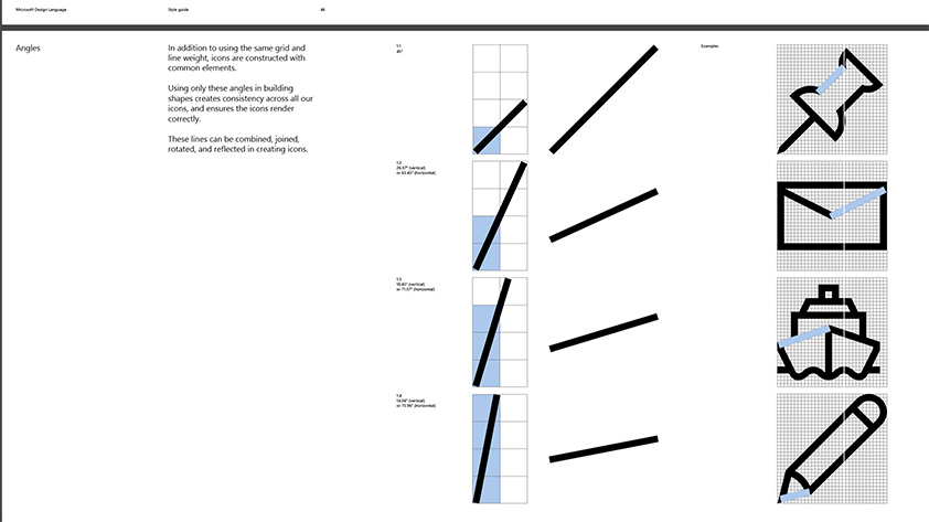
Source: Microsoft Design Language style guide
Windows 10 doesn’t look very "Swiss" at all, though. In fact, its predecessors, Windows 8 and 8.1 and (especially) Windows Phone were much more "Swiss": spare, bold and confident. By contrast, Windows 10 looks a nervous Nellie. The wireframe glyphs which were chosen because they scale better across devices are much harder to identify correctly. Windows 10 Anniversary makes even greater use of these glyphs. Windows 8.1’s Explorer looks like Vignelli’s subway diagram by comparison. I much prefer using it. In Windows 10’s Explorer, your account name is truncated when you pin your user folder to the "Quick Access" settings (“Andrew” becomes “andre”), for a start*.
Anniversary-style Windows is an Insider Edition
But what do I know? We're told that Windows 10 is “more democratic” than ever, which means it reflects the views of the same self-selecting group of people (ie, computer enthusiasts with lots of time on their hands) who volunteered for the Windows 10 Insider programme have been. These people have an even greater say this time. I was told that most of the 5,000 or so changes in W10AU were the result of the self-selectors. This may explain why Windows 10 now has an all-black theme. Volunteer computer enthusiasts love all-black themes, preferably Gothic and shiny; a WMD, a malevolent beast only they know how to tame.
I’ve pointed out the perils of crowdsourced design before. It’s a vote where some people vote early and often, but most don’t vote at all. Windows 10 is beginning to resemble this fantasy. It actually looks passable on a Surface Pro 4 with its OLED display, but is bewildering on a regular IPS panel.
Since Windows 10’s launch, Microsoft has hired experienced designers to make sense of the mess, but the results haven’t really yet borne much fruit. I’d really hoped that the Anniversary update would introduce the glimmers of some coherence into a design that was much criticised last year.
The Start control (it’s much more than a “menu”, more of a mini app) has been simplified, and the tile portion of the control works much more consistently than before. You’ll always see a long scrollable list of all applications, without having to go and hunt for it, as before. You can pin commonly used folders (but not ones of your choosing) as glyphs on the left hand panel. The hamburger menu part of the er, menu, isn’t a menu at all, but expands the folder glyphs (overlaying the all apps portion). This part at least is less confusing than before.
However Windows 10 took touch use backwards. Regular users hated being thrown into the Metro/Modern UI and back out again, but for Metro/Modern apps it was completely immersive, and apps were consistent. 10 is definitely less kid-friendly than before: mine hate now having to hunt for tiny glyphs to save and open files in Fresh Paint. I can’t blame them.
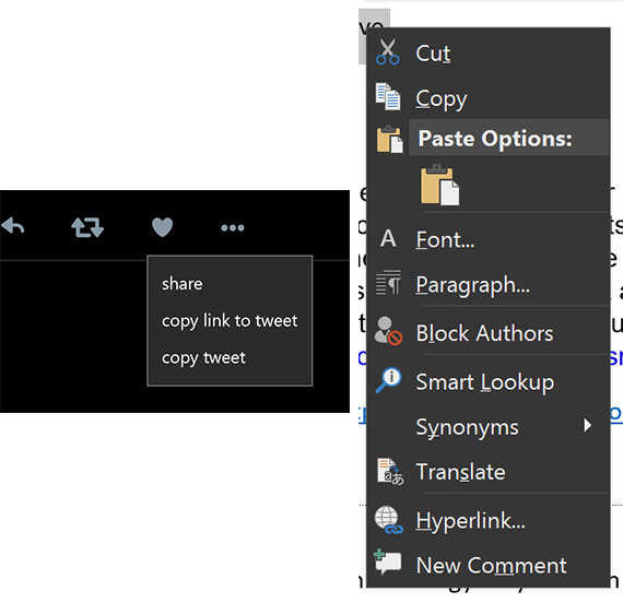
Two styles of popup menu: Twitter UWP (left), Office 2016 (right)
Good things to say: Here they are
The good points about the Anniversary Update changes? There are some, but they’re features that are still in gestation.
Edge now supports extensions, so it’s beginning to be usable for practical work. One of the extension is Microsoft’s own mouse gestures. The only two I really need (LastPass and Evernote) are there. So are two ad blockers. At last, pen input gets some attention, although it’s rudimentary and gimmicky in this first iteration.
Surface is a bit of an accessory with creatives, but the pen support hadn’t really moved on since the Tablet PC a decade ago. Now there’s an inking panel, which remembers the last inking app you used. Sticky Notes will recognise URLs, and draw will try and straighten lines. It’s basic stuff but at least it’s a step in the right direction.
There’s a new Linux subsystem (Windows Subsystem for Linux), developed with Canonical. For those of you who used the first ever Windows NT, this is a bit discombulating. On launch in 1993, NT had a tickbox POSIX subsystem (along with a command line OS/2 subsystem) so it could fulfil US government procurement requirements. This became Services for Unix (SFU) then SUA (Subsystem for Unix based applications), all of which were estate agents’ descriptions. Now it’s back.
And Cortana is starting to take shape as the glue between disparate apps, devices and services. You can now reply to an SMS received on your Android phone on Windows 10, provided Cortana is running on your Android phone. (It’s only available in the US for now). It’s similar to what Apple does across its Mac OS and iDevices, but far more rudimentary. Cortana can convert the inking scribble straight to a reminder.
All these are saplings that could flourish. For now though, it’s only Windows 10’s superior battery life that stops me from reverting back to the Devil I Know, aka Windows 8.1. Be honest, once you stick on a start menu replacement and (if you must) Modern Mix, you are getting a more consistent UI.
I treat Windows as just another a runtime, so small UI inconveniences matter. Microsoft apps seem to run just as well if not better on other platforms other than Windows today. A case in point: the inability to save frequently used locations in Office's open or save dialog box. I don't have that problem on a Mac.
Hopefully by this time next year, the challenge of integrating tablet and desktop UIs in a way that doesn’t suck will finally have been addressed. ®
Bootnote
* This truncation bug is not a problem that will annoy users with a five-letter forename, such as “Satya”. Funny, that.
